Sunday, October 19, 2014

The 5 Main Ingredients of UX


Psychology, Usability, Design, Copy Writing & Analysis


Although, to be fair, I’m pretty sure Wikipedia’s UX pagewas written by a guy who heard about UX once… at that thing… that time…

****

1) Psychology

The mind of a user is complex. You should know; you have one (I assume). UXers work with subjective thoughts & feelings a lot; they can make or break your results. And the designer must ignore their own psychology sometimes too, and that’s hard! Ask yourself:
What is the user’s motivation to be here in the first place?
How does this make them feel?
How much work does the user have to do to get what they want?
What habits are created if they do this over and over?
What do they expect when they click this?
Are you assuming they know something that they haven’t learned yet?
Is this something they want to do again? Why? How often?
Are you thinking of the user’s wants and needs, or your own?
How are you rewarding good behaviour?

****

2) Usability

If user psychology is mostly subconscious, usability is mostly conscious. You know when something is confusing. There are cases where it is more fun if something is hard — like a game — but for everything else, we want it to be so easy that even a Miss Teen USA contestant could use it. Ask yourself:
Could you get the job done with less input from the user?
Are there any user mistakes you could prevent? (Hint: Yes, there are.)
Are you being clear and direct, or is this a little too clever?
Is it easy to find (good), hard to miss (better), or subconsciously expected (best)?
Are you working with the user’s assumptions, or against them?
Have you provided everything the user needs to know?
Could you solve this just as well by doing something more common?
Are you basing your decisions on your own logic or categories, or the user’s intuition? How do you know?
If the user doesn’t read the fine print, does it still work/make sense?
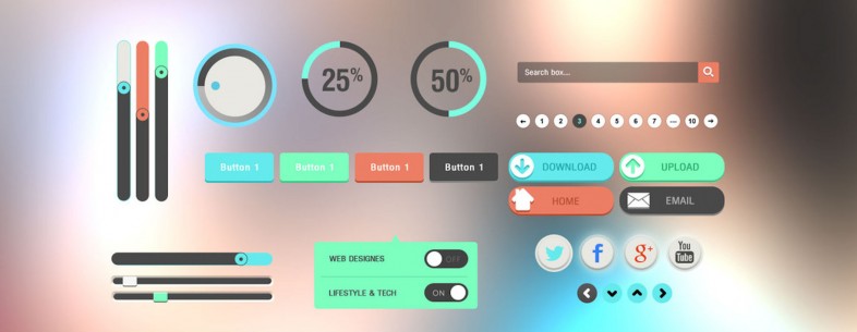
****

3) Design

As the UX designer, your definition of “design” will be much less artistic than a lot of designers. Whether you “like it” is irrelevant. In UX, design is how it works, and it’s something you can prove; it’s not a matter of style. Ask yourself:
Do users think it looks good? Do they trust it immediately?
Does it communicate the purpose and function without words?
Does it represent the brand? Does it all feel like the same site?
Does the design lead the user’s eyes to the right places? How do you know?
Do the colours, shapes, and typography help people find what they want and improve usability of the details?
Do clickable things look different than non-clickable things?

****

4) Copywriting

There is a huge difference between writing brand copy (text) and writing UX copy. Brand copy supports the image of the company. UX copy gets shit done as directly and simply as possible. Ask yourself:
Does it sound confident and tell the user what to do?
Does it motivate the user to complete their goal? Is that what we want?
Is the biggest text the most important text? Why not?
Does it inform the user or does it assume that they already know what its about?
Does it reduce anxiety?
Is it clear, direct, simple, and functional?

****

5) Analysis

In my opinion, most designers’ weak spot is analysis. But we can fix that! Analysis is the main thing that separates UX from other types of design, and it makes you extremely valuable. It literally pays to be good at it. So, ask yourself:
Are you using data to prove that you are right, or to learn the truth?
Are you looking for subjective opinions or objective facts?
Have you collected information that can give you those types of answers?
Do you know why users do that, or are you interpreting their behaviour?
Are you looking at absolute numbers, or relative improvements?
How will you measure this? Are you measuring the right things?
Are you looking for bad results too? Why not?
How can you use this analysis to make improvements?

****

Friday, October 17, 2014

The history of flat design

How the efficiency and minimalism turned the digital world flat


flat design interface

Seems as though any time you hear about Web design these days, you can’t help but come across the term “flat design.” While the flat Web design trend has been emerging in recent years, it seemed to have exploded in popularity thanks to large companies and organizations changing their design aesthetic to that of flat design.
But where did flat design come from? And why are we seeing it on the Web? As with anything in design, knowing where a style or technique came from and the history behind it can help you make more educated decisions when it comes to the use of the design aesthetic.
Let’s walk through what flat design is, its influences from previous design periods, and how flat design became so popular today.

What exactly is “flat design?”

For those of you who haven’t heard of the term, “flat design” is mainly the term given to the style of design in which elements lose any type of stylistic characters that make them appear as though they lift off the page.
In laymen’s terms, this means removing stylistic characters such as drop shadows, gradients, textures, and any other type of design that is meant to make the element feel three-dimensional.
Designers today have seem to gravitate toward flat design because it feels crisp and modern, and allows them to focus on what is the most important: the content and the message.
By removing design styles that can easily date their design (or that could quickly cause their design to become outdated), they are “future-proofing” their designs so that they become relevant for longer periods of time. Not to mention, flat design seems to make things more efficient and cuts out the “fluff.”
It isn’t quite fair to have a discussion of what flat design is without discussing the opposite of flat design. The term often given to the opposite of flat design is “rich design,” which is best described as adding design ornaments such as bevels, reflections, drop shadows, and gradients. These things are often used to make elements feel more tactile and usable to users who are navigating the website or using an application.
It is important to note that rich design isn’t Skeuomorphism. Skeuomorphism is the act of making things resemble their physical counterparts to deliberately make them look familiar.

Where did flat design come from originally?

Most anything we see on the Web or digital world today has origins from its print and art ancestries. While it is difficult to determine the exact start of flat design today or where its origins started, there are a few periods of design and art in which flat design takes inspiration from.
Swiss Style of Design
swiss cover 520x325 The history of flat design: How efficiency and minimalism turned the digital world flat
The Swiss style (sometimes called the International Typographic Style) of design is the main period of design that come to mind and deserves attention for any discussion on the history of flat design. The Swiss design style was the dominant design style throughout the 1940’s and 1950’s from which it originated in Switzerland.
Swiss design mainly focused on the use of grids, sans-serif typography, and clean hierarchy of content and layout. During the 40’s and 50’s, Swiss design often included a combination of a very large photograph with simple and minimal typography.
With typography being a major element in Swiss design, the beloved Helvetica typeface was also created in Switzerland in 1957, and was heavily used on just about everything during the time.
Just like how flat Web design today was around for a while before Microsoft and Apple made it popular, the Swiss style of design can be traced as far back as the 1920’s in Germany, but it was the Swiss who made it explode in popularity and earned the namesake (for the Art History buffs, the Bauhaus school in on architecture and typography, and the typography has similarities to Swiss design but were practicing this design style before the Swiss took claim). practicing this design style before the Swiss took claim).
Minimalist Design
18yk3cer2ztlsjpg 520x292 The history of flat design: How efficiency and minimalism turned the digital world flat
Another heavy influence of today’s flat Web design can be found in the history of Minimalism. The term “minimalism” is sometimes used interchangeably with today’s flat design, but minimalism was popular way before the Web was even a thought. Minimalism has its history in architecture, visual art, and design.
Minimalism has an extensive history and covers various mediums, but where flat design takes its influence from being mainly the design and visual art expressions of minimalism. Minimalism is well known for the act of removing everything in a piece, leaving just the necessary and needed elements. Geometric shapes, few elements, bright colors, and clean lines dominate most minimalism style designs. mainly the design and visual art expressions of minimalism. Minimalism is well known for the act of removing everything in a piece, leaving just the necessary and needed elements. Geometric shapes, few elements, bright colors, and clean lines dominate most minimalism style designs..
Probably one of the most popular art pieces from the Minimalism period is Yves Klein’s The Blue Epoch (seen below).
blue epoch The history of flat design: How efficiency and minimalism turned the digital world flat
It’s safe to say that a mixture of Swiss Design and Minimalism heavily influenced what we see today in the digital world and have named “flat design.”

Emergence of flat design in the digital world

History repeats itself, and the same holds true with the current flat design trend. As we above, flat design can be traced back all the way to the 1920’s and have influenced our current adaptation of flat design.
While many designers have worked their way to flat design when creating websites and other design pieces, it is safe to say that the likes of Microsoft and Apple made flat design pretty popular over the last several years.
Microsoft and Metro Design
0654.Metro style UI 010DA84C 520x292 The history of flat design: How efficiency and minimalism turned the digital world flat
Microsoft’s dabbing in flat design started before the current “Metro” design aesthetic was dubbed Metro. In trying to compete with Apple’s extremely popular iPod, Microsoft released the Zune media player in late 2006.
With Zune came a unique design style that focused on large, lower-case menu typography and background imagery (imagery was displayed based on the song or content loaded). The Zune desktop software that came paired with the Zune also followed the same design style, creating a fully integrated experience.
The design of the Zune operating system on Zune devices was drastically different than most of Microsoft’s other software availabilities at the time (namely Windows). When Microsoft released Windows Phone 7 in October 2010, it took what the company learned from the design of the Zune and applied it plus more to the look and feel of the Windows Phone 7: large, bright, grid-like shapes, simple sans-serif typography and flat icons dominated the style on the Windows Phone 7. and applied it plus more to the look and feel of the Windows Phone 7: large, bright, grid-like shapes, simple sans-serif typography and flat icons dominated the style on the Windows Phone 7.
This design would soon be called “Metro” design by its creator, Microsoft.
The design became so popular that Microsoft kept with the Metro design style and introduced it in its Windows 8 operating system, keeping with a strict grid of blocks of content, sharp edges, bright colors, sans-serif typography, and background images. This same design style is still used by Microsoft in nearly all of its software and devices such as the Xbox 360 and its current website (though the Metro name has technically been discontinued).
Apple Shakes Skeuomorphism
ios 6 ios 7  520x500 The history of flat design: How efficiency and minimalism turned the digital world flat
While Microsoft was working on its flat design style, Apple had something else up its sleeve. Apple started hinting at moving away from its use of Skeuomorphism, and then completely abandoned the perfected Skeuomorphism in favor of a flatter design with the release of iOS 7 in the summer of 2013.
Since Apple has a pretty strong following with a rather large group of early adopters of new devices and technology, the design of iOS 7 seemed to have made flat design even more popular than it was before practically overnight.
Apple’s design aesthetic often heavily influence the design of websites and apps because most designers feel that the design is appealing and modern. Thus, when Apple switched to a more flat design style, Skeuomorphism seemed to become almost instantly outdated and sites and apps that used the design style quickly found that they needed a redesign.
This is most evident in the different apps that have been updated to work well with iOS 7 — they all follow the flat design aesthetic that users of iOS 7 have become accustomed to throughout the OS.
Responsive Design
It is important to note too one of the reasons flat design has become so popular in recent years as well is the development of responsive design. As more devices are connecting to the Web, with various screen sizes and browser constraints, designers are finding that their tried-and-true design styles that relied heavily on textures, drop shadows, and fixed imagery don’t translate as well when you have to shrink those designs into smaller and smaller .
Flat design allows for Web design to become more efficient. Without extra design elements in the way, websites can load much faster and are easier to resize and form around the content it holds.
This also goes hand in hand with our screens becoming more high-def and the need to display a crisper image. It is much easier to display crisp boxes and typography than it is to make several different images to accommodate all the various devices and features out there.

The future of flat design

While no one has a crystal ball, it is safe to say that flat design will eventually run its course and will be replaced with something even more new and exciting, just like various other design styles did before it (take Skeuomorphism for example).
There are obvious flaws in flat design in the digital world (such as removing the visual clues that are needed to determine if something is clickable or not), but as designers experiment, test, and learn, flat design will evolve and eventually a new style will emerge that will leave flat design in its dust. flat design in the digital world (such as removing the visual clues that are needed to determine if something is clickable or not), but as designers experiment, test, and learn, flat design will evolve and eventually a new style will emerge that will leave flat design in its dust. to determine if something is clickable or not), but as designers experiment, test, and learn, flat design will evolve and eventually a new style will emerge that will leave flat design in its dust.
One clue that we may have to what the future holds for flat designs (or even after) is the current design work of Google (mainly in their mobile apps). While Google’s applications are showing signs of flat design, it does not seem to be removing elements such as drop shadows; it also still uses gradients in subtle ways. The company seems to be taking the best of flat and rich designs and integrating both in a way that just works. Maybe Google (or even after) is the current design work of Google (mainly in their mobile apps). While Google’s applications are showing signs of flat design, it does not seem to be removing elements such as drop shadows; it also still uses gradients in subtle ways. The company seems to be taking the best of flat and rich designs and integrating both in a way that just works. Maybe Google out something we haven’t?
While flat design seems new and exciting, and is a fastly growing trend, it isn’t nothing new in the course of design history. With influences from Swiss design and Minimalism, flat design is just a reincarnation of its print ancestry in our digital lives.

Key visual mobile metrics to improve your app’s design success

Design course
Over the past few years there has been a dynamic shift with regards to how software and user interfaces are designed. Trends in design that have been the most prominent include 3D and Skeumorphic to minimal and flat.
What brought about this change? Mobile went simple. Colors, designs, fonts, character sizes – all simplified. This trend, unlike others before it, has staying power. The overwhelming aspect of content delivery on such small screens can be remedied by utilizing a minimal UI approach.
Simple design by no means dictates that your site has to be ugly. There are countless ways to build an attractive app without going overboard on design.
App publishers are adapting to these trends by melding it with the study of user behavior. Designing a user interface that makes people feel and act the way you intend is pure psychology. It is paramount that you understand exactly how your users think when they perform specific actions within your app.

Key metrics to measure to optimize your app

teen texting smartphone 730x403 Key visual mobile metrics to improve your apps design success
To optimize your app and maximize the mobile user experience, you must focus on some key metrics that are covered under the engagement umbrella. There are quite a few, but I will focus on metrics that derive from the ways users visually interact with your app.
The core reason for focusing on the engagement category of metrics is because this is where user interaction with your app’s design is the strongest. Users navigate to the various screens within your app a great deal and check out different areas of your app. They tap, swipe and convert on your calls to action.
Focus on how your users interact with your app visually. Why do users spend more time on certain screens, or how do they engage with your calls to action? Why do they drop out? Here are some key metrics:
Drop off rates
Within the various conversion funnels of your app, you notice users dropping out when they reach a certain screen. By understanding the why behind the reasons they are dropping out, you can optimize accordingly.
Perhaps it’s because they are tapping non stop on an image that they feel is a call to action, but it is just an image that doesn’t lead to your app taking them anywhere. If you want to make a call to action stronger, refine the screen’s UI design or A/B test new CTA placements to cut down the confusion and see which works the best.
Screen flow
By analyzing this metric, you will identify where users are going and how they navigate between the various app screens. You can see where they might be experiencing friction in your checkout process for example and where they might be getting stuck, which could lead them to abandon a cart full of items.
Say, for example, they abandon their cart because they cannot see relevant product information. This hiccup in your UI design will be a place you can fix to smooth the checkout process and increase conversions.
Retention
Your app’s retention rate is a key metric under engagement, and many argue the most important one. By studying your retention rate, you can see what you are doing right or wrong in many contexts.
Say, you just relaunched your app after extensive UI changes on a number of screens that you saw users dropping off. By studying, retention reports on how often your users return to your app in a certain timeframe, you will gain a deep understanding of your app’s design in meeting users’ expectations.
Refining and optimizing is a constant process, and with the right design changes you will see your retention rates soar.

Friday, August 23, 2013

5 Ways How Whitespace Affects The User Experience


Whitespace is becoming an increasingly popular design element for websites. The termwas originally coined in print design and describes “the absence of text and graphics”. At the same time, whitespace is more than an empty space. It’s also “the overall airiness or density of the page including space between lines of type (leading), text offset around graphics, size of margins, and heaviness or lightness of the fonts”.
In web design, whitespace can be defined in a similar way. The only difference is that it doesn’t have to be white. Rather, whitespace comes in forms and colors. Consider it the opposite of your content. Whitespace can create a structure, carry meaning, and guide the user, but it doesn’t attract attention to itself.

There are a lot of resources out there that explain whitespace in more detail, or bring together inspiring designs that use a lot of whitespace. Let’s not get stuck with the same questions.
Instead, let’s take a look at just what it is that makes whitespace so special. Here are 5 key effects that whitespace can have on the user experience of your site:

1. Whitespace makes your design usable

First of all, whitespace is a great design principle to help you make your design more usable. It’s not a secret that good usability is crucial for any successful site. So make sure you pay enough attention to your users and their goals: Who are the people that visit your site? Why do they visit? And what is it they do on your site?
Those are questions you need to answer before you even get started on your design. Once you have a clear design objective, you can use whitespace as effective tool to (1) guide your visitors through your site, (2) help them find what they are looking for, and (3) make interactions stand out.

The clean design with lots of whitespace allows you to effortless navigate the site and focus on the most important content.
The BREE webshop perfectly demonstrates what it means to make a design usable by adding some whitespace. The site is very clean and minimalistic, while using a clear hierarchy for the presented content.
On this detail view, clearly, the picture of the purse is most important to the user, followed by the name, description, price, and other product descriptions. Elements like the main site navigation are available, but stay in the background.

2. Whitespace makes your content readable

A key aspect of good usability is the readability of your content. The readability is even so critical that it deserves to be mentioned separately.
Whether your content is readable or not depends on many different factors. For example, it depends on the font you choose, the font size and color, the structure of your text, and whether or not you use highlights, images, and subheadings to make it scannable.
At the same time, whitespace plays an important role for the readability. Whitespace defines how you arrange and align different text elements – from entire paragraphs down to the single letter. For example, aligned elements look much cleaner and are easier to digest. Also, let your content breathe and mind spaces between paragraphs, line heights, and even your letter spacing.

This text is highly readable, because it follows all the rules there are for readability.
Like mentioned before, whitespace doesn’t have to be white. Rather, it describes the spaces between your content on multiple levels. The site of WWF offers us a very positive example of how whitespace – or in this case ‘negative space’, because it’s black – possitively affect your readability.
Even though, there is quite a lot of text to read, the page doesn’t look packed. There is lot’s of space to the left and to the right of the content. Also, paragraphs are clearly separated from each other, and there is a generous space between the two columns. Besides, the line height is very user friendly, allowing you to quickly read through the text.
Of course, whitespace is not everything. Other aspects of good readability, such as a readable font, high contrast, and a well-structured text are also in place here.

3. Whitespace gives your visitors a break

The web – like most other aspects in life – become more and more advanced. We are dealing with a constant overload of information and the choices that come with it. Sometimes, this can get overwhelming. Then, all we want is silence and a mental break.
In case you haven’t noticed, the buzzword here is simplicity. There are countless websites out there and probably some of them are similar to yours. Why not stand out by spoiling your users with a break? Keep your design simple. Help your users make choices – or even better, make some of the choices for them.
Whitespace is the perfect design element to focus on what’s most important. Don’t confuse your visitors, but present them with what matters most. Don’t distract them with unnecessary clutter, but help them focus on their goals.

Whitespace allows for a design no clutter, no distraction, no choices to make.
Whitespace can have a calming effect, drawing attention to a few key elements. Dropboxhas chosen for a very minimalistic landing page with looooots of whitespace. There is no clutter, no distraction, no choices to make.
The website is very simple and refreshing. Only when scrolling down the page, you get some extra information. Basically, once the user is looking for more info, when they are willing to engage further with the site, they can. If they don’t want to, they don’t.

4. Whitespace comes with a modern look & feel

A simple design with lots of whitespace does not only add to the usability of your site, but also to its visual appeal. Minimalism is considered a modern style and sites that work with a lot of whitespace often look very professional and trustworthy – if well-designed, of course.
Especially in e-commerce, giving products some extra space makes them look more exquisite. Not only do they get more screen real-estate, they also draw more attention, due to the lack of tangent elements.

Whitespace can put a single element into the focus of your users, making it more special than the rest of your content.
The Rolex website has a very exquisit look & feel. Of course, this didn’t happen by chance. The brand itself is very expensive and special. Using a lot of whitespace to design the website was therefore a smart choice.
Once you open the homepage, the product is put right to the center of your attention. There is some text to accompany the image, but other than that, the page is very quiet – almost mysterious. Yet, the design is very well balanced and does not at all look empty.
The shadow of the watch adds a small 3D effect to the site, creating a sense of depth. This subtle detail gives the product even more room, making it look even more important.

5. Whitespace makes your design emotional

Last but not least, whitespace can add an emotional touch to your design. Again, it doesn’t have to be white, but can be any color, shape, or pattern you want. Just like background images, background colors can have a big emotional effect on us.
You can also use effects, such as parallax scrolling to make your whitespace interactive and more fun, or you simply use gradients or patterns to add some excitement. The tone you set with your whitespace – and that can be through the amount, or the design of it – affects how people will receive your content.
Instead of seeing whitespace as the leftovers of your screen real estate after you have placed your content, you should see it as an autonomous design element. You decide where to put it and what effect it has on the rest of your design.

Whitespace can appeal to our emotions, and trigger us to think or feel certain things.
Cirque du soleil creates a magical and very inviting sphere on their international site – using a lot of whitespace and integrating that space with the main visual element of the site. The visual is appealing and very interesting, drawing your immediate attention.
The design creates a very comfortable feeling of unity. At the same time, it makes you curious of what to expect once you have selected your continent. The quiet and warm background color invites you to dream away and leave room for a lot of own ideas and your own phantasy.

Friday, July 19, 2013

The Difference Between UI and UX

In today’s creative and technical environment, the terms “UI” (User Interface) and “UX” (User Experience) are being used more than ever. Overall, these terms are referring to specialties and ideas that have been around for years prior to the introduction of the abbreviated terminology.
But the problem with these new abbreviations is more than just nomenclature. Unfortunately, the terms are quickly becoming dangerous buzzwords: using these terms imprecisely and in often completely inappropriate situations is a constant problem for a growing number of professionals, including: designers, job seekers, and product development specialists. Understanding the proper separation, relationship and usage of the terms is essential to both disciplines.
UI != UX
“UI refers to the aggregation of approaches and elements that allow the user to interact with a system.”
“Consider user experience as the reactor or nucleus of a brand.”
UI is a Tool
Incorrect Usage is Dangerous
“Unthinkable amounts of time and money are spent to dance around the incorrect focus and usage of these terms.”
Finding the Right Designer
Responsibility For the Problem
“It is not that one designer cannot handle both areas. It is about the tools and ability to problem solve.”
Conclusion


The most common misconception that you will hear in the workplace, in client meetings and often in job listings or job requirements is the inadvertent combination or interchange of the terms. In many cases, the incorrect expectation is that an interface designer by default understands or focuses on user experience because their work is in direct contact with the user. The simple fact is that user interface is not user experience. The confusion may simply be because both abbreviations start with the letter “U”. More likely, it stems from the overlap of the skill-sets involved in both disciplines. They are certainly related areas, and in fact many designers are knowledgeable and competent in both.
However, despite the overlap, both fields are substantially different in nature and – more importantly – in their overall objectives and scope. User interface is focused on the actual elements that interact with the user – basically, the physical and technical methods of input and output. UI refers to the aggregation of approaches and elements that allow the user to interact with a system. This does not address details such as how the user reacts to the system, remembers the system and re-uses it.
Such problems bring us to the user experience. Don’t be fooled! User experience is much more than just the end result of user interface. Instead, I have always found it best to consider user experience as the reactor or nucleus of a brand. A brand being, in essence, the sum of the experiences that a person has with a company or organization. User experience is the goal. Not just the goal of an interface, but of a product or interaction with an organization. When good user experience is achieved, every desirable or positive effect that one could possibly think of flows from it. UX is focused on success of the whole. In reality, the product is not the sum of its parts; the experience is.
At the end of the day, that is all we get to leave the user with: a memory. As we all know, human memory is astounding but it’s imperfect. Every detail contributes to the ingredients of a good user experience, but when it all comes down to it, the user will remember products in somewhat skewed way. UX contains a much bigger picture than UI does but it still relies on the smallest details to drive it. This understanding is the most powerful asset anyone can have in product development.
User interface is one of the most powerful tools at our disposal in the quest for great user experience. Why? Simply, the interface is the most tactile, visceral and visible method with which our users interact with us. UI is the front line. This is possibly the best explanation for why the two terms are so often used interchangeably or combined into one.
Communication is complex and can be confusing. The development of precise and specialized terminology facilities easier communication. But what happens when we are effectively not speaking the same language?
What if I said, “Use a screw” meaning a corkscrew metal fastener to an engineer assembling a product, but he thought it referred to an angle bracket or chemical adhesive? The product might have some serious problems. Granted, interfaces and experiences aren’t going to literally blow up in our face. However, the effect is no less powerful. Unthinkable amounts of time and money are spent to dance around the incorrect focus and usage of these terms. Eventually, wasting time and money will put a company out of business or cause products to fail. Improper application of the concepts can be disastrous.
Some of the most common usage failure for the UI and UX terms is where it matters most: job listings and requirements. It is already difficult to locate excellent candidates for specialized jobs such as interface design and user experience design. But it’s certainly more difficult to hire the right person for the job when the skill set and design focus are miscommunicated. It’s expensive to hire a specialist, and it’s even more costly to hire one that cannot solve the problem you need solved. More often than not, the job requirements and responsibilities are skewed toward the UI designer job description but come loaded with the responsibility and expectation of a UX designer.
Whether a UI or UX designer, there is still the element of design. Design is a solution to a problem. When roles are clearly defined and universally understood, it’s much easier to attack a problem, propose a solution and execute on it. In the case of UI and UX, the problem normally applies to situations where the responsibility for the interface and the experience is assigned to one designer who simply does not have overall control of both aspects.
It’s tough to own up to a problem when the ability to solve it is not in your hands. A UI designer may have the ability to create interactive designs, icons, colors, text, and affect a number of other elements that solve problems dealing with direct interactions to the user. Those elements are fantastic tools to affect user experience but they are only part of the equation. The user experience is influenced by a multitude of things such as marketing copy, speed, functional performance, color scheme, personality, customer support, set expectations, financial approach, visualization… well, you get the idea.
It isn’t fair or practical to tell the UI designer that they are responsible for all these things and more. It isn’t that user experience cannot be designed. If the situation were reversed for a UX designer it would be equally difficult. In order for a designer to rightly take ownership of the UX problem, they must be enabled to recommend and effect changes, implementations and decisions that control the experience. The flawed understanding is about designer focus and scope. It is not that one designer cannot handle both areas. It is about the tools and ability to problem solve. Effectively, a builder without any tools is just as powerless to build as a person with no skill or knowledge.
The first step to successfully attacking any problem is to understand what must be done. Understanding the difference between UI and UX is an intellectual asset with staggering ramifications.
From hiring the right person for the job to simply understanding what is required to approach the problem, proper knowledge of the UI and UX terminology is a simple way to facilitate better communication, better problem solving, better design and better user experience.