"Know Your Users" is the mantra of any good designer. Yet, what should you actually know about your users?
Over the years, we've studied the usability of hundreds of product and web site designs. We've seen designs that were incredibly effective for users and designs that fell tremendously short. One emerging pattern in our ongoing research is that design teams that know a lot about their users are more likely to produce user experiences that are usable, effective, and pleasing.
In a recent usability test, we had the chance to observe a user, Leslie, visit Citibank's web site. Leslie had done business with the bank for years, through her existing checking, savings, and credit card accounts. It was the first bank account her parents set her up with and she'd been a loyal Citibank customer ever since.
Leslie had recently come into a large sum of money, due to the unfortunate death of her ailing grandmother. Her grandmother was an important role model to Leslie. Leslie really wanted to take her inheritance and invest it for the future, just like her grandmother had done. However, she didn't know how to begin.
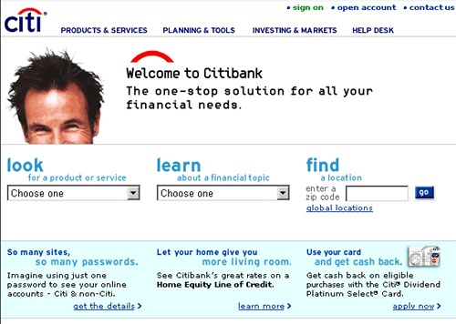
Because of Leslie's loyalty to Citibank, who had always taken care of her money, she decided to turn to their web site for advice on investing. On the Citibank.com home page (figure 1), she was first tempted to go to the "Investing and Markets" link at the very top-center, but then the "Learn about a financial topic" pulldown caught her eye.

(Figure 1 - Citibank Homepage)
Since she'd never really had enough money to invest before, she really was looking to learn about what all of her options were. She was thrilled that the pulldown contained an entry labeled 'Investing'.
Before Leslie clicked on that entry, we asked her about what she thought the site would give her. She told us that she was looking for a good introduction to investing, outlining what all of her options were for putting this money away for the future.
Leslie had all sorts of questions: Should she use the money to buy a house? Or invest in the market, since prices were so low? Or maybe she should do a little of both? Are there other ways to invest money that would work to better advantage? She was excited and anxious, feeling like a whole new world was opening up in front of her.
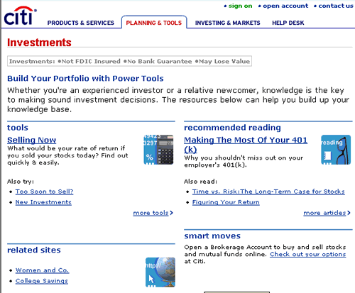
Until she clicked. The site presented Leslie with a page that didn't contain any answers to her questions. Nor did any of the links seem to have anything to do with her issues. While the site promised that she would learn about investing, there was little she could learn from the content on this page.

(Figure 2 - Citibank Investing page)
It wasn't that the page was blank. It contained all sorts of information. It just wasn't matching why Leslie had come to the site. With just two clicks, Leslie -- a life-long, dedicated Citibank customer -- decided to go elsewhere to invest her money.
Leslie's experience is far too common. Citibank probably knows more about Leslie than any other institution on the planet. They know how old she is, where she was born, what languages she speaks, how much money she has, where she spends it, who her employer is, where she lives, what her hobbies are, and where she vacations. Yet, the design team didn't have the required information to make Leslie's experience a successful one.
Was Leslie an outlier? Was she outside who Citibank was designing for? Possibly. We haven't talked with the team at Citibank, so we can't say for sure.
It's very possible that they've decided to go after more experienced investors, leaving folks like Leslie to seek other sources, even if they have been life-long Citibank customers. That being said, Citibank.com does proclaim on the homepage that they are the 'one-stop solution for all your financial needs'. Sounds to us like they intend to help people just like Leslie with exactly these types of questions.
Leslie large inheritance is a somewhat unusual circumstance. Is it really possible to design for her strange situation? Is it practical? Absolutely.
While it's rare that someone inherits a large amount of money without an investment plan, it's not unusual for people to start thinking about investing. Many sites have no trouble helping new investors.
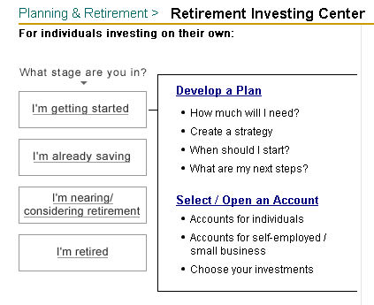
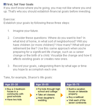
Fidelity.com (figure 3) and TDWaterhouse.com (figure 4) both have excellent retirement planners that would help Leslie (and many others like her) answer these questions. The Motley Fool (figure 5) provides a great 13-step intro, along with a getting started guide.

(Figure 3 - Fidelity Investing page)

(Figure 4 - TD Waterhouse Investing page)

(Figure 5 - Motley Fool Investing page)
Even Citibank's competitor, Wells Fargo, will email Leslie an excellent tutorial on investing basics -- answering every one of her questions.

(Figure 6 - Wells Fargo Investing page)
So, why did Citibank's design team fail to answer Leslie's questions with the site? It wasn't because they didn't know how to design a quality web site -- the site is very nicely put together. And it wasn't because these types of questions are hard to answer -- other sites do a more than adequate job.
The problem is that team didn't know anything about Leslie. They needed to know why Leslie was coming to the site (her 'intentions'). They also needed to know that she'd just come upon a huge sum of money (her 'context'). The team also needed to know what Leslie knew about investing (her 'knowledge'), what she was capable of doing herself (her 'skills'), and the nature of the financial management she'd done in the past (her 'experience').
The user's intentions, context, knowledge, skills, and experience are the essential things that every designer needs to know. Without this, the team is going to design something that seems useful, but they'll never know if it actually helps the user. The result is exactly what we see with Citibank's design -- a lot of content, but not the right content.
Unfortunately, these five things are beyond what normal market research can tell us. Market research can tell us age groups, income levels, geographic regions, even purchase behavior. But it can't tell us the key things we need to know.
Intentions are key, because they tell us what the user is trying to accomplish. They dictate the tasks on the site. A high school senior who is shopping around for the right college has different intentions than the student who is ready to apply for early admission. Both of these intentions dictate different design requirements.
Context is also important. Someone who is faced with putting their first PowerPoint presentation together will interact with the application's features differently if the presentation slides are due in 3 weeks than if they need to ready for a board meeting this afternoon. For example, they'd be less likely to explore all of the application's chart customization capabilities when rushed and therefore need the defaults to be acceptable for important meetings. They wouldn't play with a how-to tutorial or try lots of ambiguous menu options, just to see what they do.
Knowledge, skills, and experience are also critical. The user's knowledge dictates the terminology and concepts that they are familiar with. Someone with a medical background will know the difference between hypoglycemia and hyperglycemia. However, a parent of a newly diagnosed child with diabetes might confuse these two life threatening (and very different) conditions. Designers might choose terms like "Low Blood Sugar" and "High Blood Sugar" if they understand the user's existing knowledge.
The user's skillset also dictates design decisions. When designing an intranet procurement process, the designers would create different screens for those materials procured by seasoned buyers, who have been doing purchasing for decades, than for the occasional employee who needs a new computer or office supply.
Finally, the user's experience is a design factor. An experienced business traveler would know to avoid certain airports at certain times of the year, like Chicago's O'Hare in the winter, because of likely weather delays. A clever reservation system might recommend an alternate hub, such as Charlotte or Dallas, which doesn't run into the same problems.
These five attributes are critical to quality experience design. So, how would the team at Citibank find out what they need to know?
The problem can be broken into two pieces: information gathering and analysis. There are many techniques for information gathering, from informal interviews and discussions to more formal ethnographic techniques such as Contextual Inquiry, made famous by Karen Holtzblatt and Hugh Beyer of InContext Enterprises.
For analysis, we're very fond of Persona development techniques, popularized by Alan Cooper, and of the mental model and gap analysis process practiced by the folks at Adaptive Path.
Techniques like contextual inquiry, persona development, and mental model analysis can make or break a team's design efforts. Without these, much effort can go into the development of the user experience, only to have it fail for the user because the team failed to know what they needed. •