Users should be able to simply, quickly, and intuitively use any web app, like with any tool in life, be it a car, phone, or anything else. After all, a useful web app doesn’t do much good if it’s a pain in the butt to use – many users will eventually give up and go to an easier-to-use alternative.
So how do you maximize usability in your web app? In this article we share 10 Web Application Usability Guidelines that we feel are essential.

Watch what the user does, not what they say. It’s that whole Henry Ford saying that if he asked people what they wanted back in the day, they’d say “a faster horse-drawn carriage” rather than car. Don’t take user feedback as seriously as much as having test users try out your web app. What the user isn’t even conscious of you’ll be able to see immediately and fix any interface issues.
Okay, now here are our 10 Web Application Usability Guidelines:
Okay, now here are our 10 Web Application Usability Guidelines:
1. Have a Consistent and Standardized UI
Whatever you settle on for your interface, keep it constant. Don’t have one style for one page, another style for other pages, and whatnot. It takes long enough to establish familiarity with an interface – don’t make it even harder for the user by introducing inconsistency, be it color scheme, layout and order of elements, and anything else. Also, try to use as many standardized elements as possible. There’s no need to get creative with buttons – it’s not an art piece, it’s an actionable item the user will frequently click on and not think about. Have buttons look like buttons, check boxes look like check boxes, sliding/”click next” areas look just like what they do, and so forth.
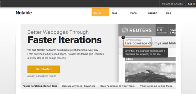
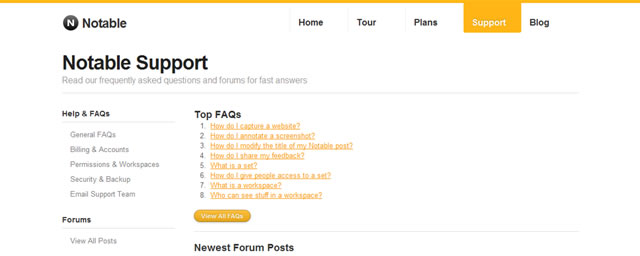
Example: Notable App
Notable is allows you to take any webpage screenshot, sketch or wireframe and exchange notes on specific details with anyone and is a fantastic example of what we have just been talking about. The homepage, all internal pages and the actual application all have a consistent UI and standard styling, as you can see from the images below:
Homepage Screenshot
Internal Page Screenshot
Application Screenshot
2. Guide the user
The worst thing to a user is having to guess what to do next. Guide the user so he or she won’t have to. If you want them to proceed onto the next step, then make it clear where to click to progress. If one action is more important than the other, have the button or action area for it prominently displayed. You don’t need to go as far as hand-holding the user (which could turn some people off), but limit the choices and make the desired choices ridiculously obvious.
3. Make (Call-to-Action) Interactive Objects Obvious
This is an extension of tip #1. Make click and tap targets as large as possible. Why hide them if you want the user to be clicking on them? Haven’t you felt frustrated pixel-hunting for a button in certain web apps? Don’t make your users suffer the same – make the interactive objects big and obvious. At the very least, make interactive objects noticeably bigger than the surrounding elements and text so that they stand out.
Here are some effective examples of Call-to-Actions buttons:
Here are some effective examples of Call-to-Actions buttons:
Squarespace

Firefox 4

Vanilla Forums

4. Give Feedback – Both for User’s Interacting and Progressing
There’s few things worse in a web app than not knowing if your click or tap went through. You sit there like a sucker waiting for the action to complete when in reality your click or tap didn’t even register – especially when it’s for a process that asks not to click multiple times. So give visual feedback when a user’s interacting, as well as the user’s progress if applicable.

When a user clicks or taps a button, you can have a visual feedback that the user has done something, be it a loading wheel, a change in the button’s appearance, or any other visual cue. The same goes for progress – if a user is uploading a file or something, have a loading bar so they know it’s loading as well as how much time is left. Don’t leave them guessing if their file is uploading, the browser decided to give out, or some other error occurred.
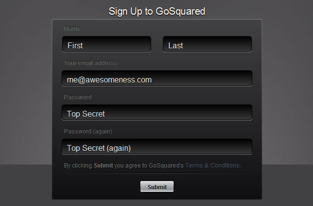
5. Never Have Users Repeat Anything & Keep Signup Info to a Minimum
Ask for any info only once. After all, don’t you hate repeating yourself (*cough* calling tech support or any other phone service *cough*)? Don’t make users suffer through that. Have them perform any action only once, ask them for info only once, and anything else that your web app needs from the user should only be done once.
The quickest way to turn a potential user away from your app is to ask them, when they are signing up, to fill in lots of text-fields. There really is nothing more annoying and time-wasting. Ask for only for a maximum of five or six fields, that should be enough to keep their interest. Should you need more information after signing-up ask for it then.
The quickest way to turn a potential user away from your app is to ask them, when they are signing up, to fill in lots of text-fields. There really is nothing more annoying and time-wasting. Ask for only for a maximum of five or six fields, that should be enough to keep their interest. Should you need more information after signing-up ask for it then.
Example: GoSquared
GoSquared, an app that monitors your website’s visitors in real-time, has a very simple (yet well designed) and effective sign-up form, you can view it in the image below:
6. Always Have Default Values in Fields and Forms
This is related to tip #1: guiding the user. Having a simple default value in a text field will push the user in the right direction as to what they need to type in. “First name”, “Last name”, “Email address”, “Password”, “Country”, and so forth.
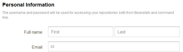
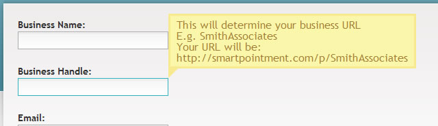
7. Explain How the Inputed Info Will Be Used
A continued theme of not having the user guess or be uncertain as to what’s happening in your web app. Make it as clear, comfortable and affirming as possible for your users by clearly explaining how any inputed info will be used. “Your email will be your login username”, “Your location will be used to *do something*”, and so forth. Here are some examples:
Beanstalk App
SmartPointment
8. Don’t Have any Reset or Mass-Delete Buttons
Big red “self destruct” buttons are big no-no. There’s almost no situation where a user will have to wipe every scrap of data and start again – usually it will be going back and fixing or changing one or a few values. Thus, a reset and mass-delete button would serve no purpose other than to frustrate the user by having to input everything again should they accidentally click the button (or out of curiosity even). Avoid this by not even giving users the option.
9. Have Clear and Explanatory Error & Success Messages
Related to tip #7, this further puts the user at peace and comfort with your web app. You reaffirm that nothing major is wrong, or that it wasn’t their fault for getting the error message, or whatever else.

Instead of a “Oops, something went wrong” message that doesn’t inspire confidence, have something more specific and explanatory like “Our database which holds your account info is temporarily inaccessible and will be back shortly”.
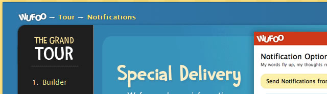
10. Include a Clear Visual Hierarchy and Navigation (Breadcrumbs)
Similar to tip #3 (have interactive objects be obvious), make sure your layout and navigation is very clear. This gives the user a sense of where they are in your web app, which makes them feel in control and confident in using your web app. A user should never guess where they are, because then they’ll be afraid to explore and go back or forth and whatnot and risk getting even more lost. Have clear ‘breadcrumbs’ at the top of the page which includes the visual hierarchy of where the user is navigation-wise (ex. “*Main menu* > *sub-menu* > *settings*”) as well as on the page itself, so they know where to look and where to click or tap to go to their desired page.
Example 1: Delicious
Breadcrumbs are traditionally used as a sub-navigation, but with Delicious, they are elevated prominently and used as the main nav tool for the user. This is perhaps the only truly perfect example of breadcrumbs being used (can you think of any better?):
Example 2: Wufoo
Unlike Delicious above, Wufoo uses breadcrumbs as guidance only which is the most common use for web apps.
What do you feel are the most Essential of Usability Guidelines?
Over to you: What do you feel are essential usability guidelines for web app development? Feel free to share your comments below.