Introduction
If you are a Web designer or Web application developer, it is very important to be familiar with Web usability guidelines. Most people put a lot effort in the visual design & code improvements but tend to ignore the usability factor of the Web application. Which is funny since easy implementation of simple usability improvements are much more useful to end users than complex(hard to implement) application design/code improvements.
Most of the usability guidelines are common sense stuff. But implementation of them in a Web application sometimes require considerable thought. Sometimes it is a balancing act between usability and application performance. Following is what I consider to be the Top 10 Web Usability Guidelines.
Top 10 Web usability guidelines
Make it obvious – The Web application screen should clearly present what it is about. As far as possible it should be self evident. The browser title, page title, section headers etc. should make it obvious what the page is about. Also things that can be clicked should be immediately identifiable as clickable and shouldn’t require any thinking from the user.
Create a clear visual hierarchy – Newspapers have been using visual hierarchy for a long time. The hot news of the day always appears as the biggest text. The same should apply for Web page design. For example, the page title should be more prominent than anything below it. Also content relationships can be explained visually using hierarchy. GUI controls such as tab panes can be used for this.
Follow conventions – Unless you are creating a design portfolio or a flashy demonstration, your Web site should follow common Web page conventions. People think that underlined text is a link, a button is clickable and bigger text are headings. Keeping the text readable and non cluttered is very important.
Avoid needless text – If you have a button with text "Login", you don’t need a help text above it saying that "click Login button below to login to the system". It is stupid and redundant and it only adds unnecessary noise to the screen. Help text is rarely required and even if it is needed, it should be hidden by default. A web user needs help text only once!
Provide proper navigation – Web application usually doesn’t give any sense of scale or direction. As a user we have no clue as to how many pages are in the system and what options are available. The purpose of navigation is to help the user in navigating through the relevant pages with minimal thinking effort. Navigation should also provide a feedback as to where the user is in the application. Breadcrumbs are ideal for this purpose since the it shows the route the user has taken to reach an application screen. It also allows him to go back to his initial starting point. Also it is important to have a link which takes the user to the starting point of the application (home page link perhaps?).
Conduct usability testing – This is rarely done in Web applications, but if done this can give tremendous insight into user behavior. Take a sample of the intended audience of the Web application and ask them to go through the application. Sit with them and interview them as they go through the application. Many things that application developers take for granted is confusing to the end user. Check this link for a detailed look at usability testing plan.
Provide all information that you can – This is an often ignored aspect of Web application design. Your aim should be to provide as much information as you can to the end user without compromising on application performance.
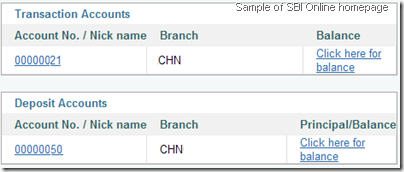 Here is a practical example of this. State Bank of India (SBI) provides an excellentonline banking platform(probably the best in the country). If you have a lot of money, SBI internally creates fixed deposits and automatically moves the money to fixed deposit accounts. This is good since you get a better interest rate for your money. But there is one problem. For the account holder, these are shown as different accounts. Hence the only way to find your total bank balance is to go through all the accounts and then manually add the balance(It requires N*2 mouse clicks where N is the number of accounts you have)!! From the system design point, this would have been a simple link named "total balance" with a single SQL query like this,
SELECT SUM(balance) from USER_ACCOUNTS WHERE ACCOUNT_MASTER_ID = ?
But so far no one in SBI development team has thought about it. If they had done a usability testing, they would have found it in 10 minutes. [Update in August 2010 - This is now implemented.]
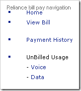 Another example is the online portal (My Reliance Mobile) that Reliance provides for the NetConnect mobile Internet and post paid mobile connections. This site provides user details, bill details and even facility to pay bills online. But unfortunately one important piece of data is missing. The current NetConnect plan you are on! It is buried in one of the PDF bills and is completely unreadable (it is shown as something like RNJ149DATA). Another interesting thing about this site is that the navigation options change without any reason as you go across different application screens!
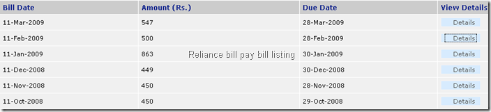
The Reliance bill pay site is notable for a large number of usability issues. For example, take a look at the bill list screen (see below). There is no way to find whether a bill is paid or not! (the view details opens the bill in PDF format),
Web accessibility – You cannot assume that all the Web application users are in perfect health or has perfect eye sight. Some may have difficulty in reading and some may be handicapped. So if your screens use a 8px fixed width font with light gray color, a sizeable percentage of the target audience may find it unreadable! There are some simple things that you can do to make your site more accessible,
1. Allow the user to change the font size. Allowing arbitrary sizes can sometimes distort the application screen, so providing 3 fixed sizes (small, default, large) is better than providing none.2. Always provide alt text for any images used. Blind users use software (screen readers) that can read the alt text and they will get to know what the image is about.
Home page design is important - The home page design should be given special attention due to two reasons,
1. It is the starting point for the application.2. It is the most visited application screen.3. It defines the overall site architecture including navigation, logo, search, site hierarchy etc.
So it is important to design this to provide as much information required for the user without compromising application performance. Home page should contain information that the user is immediately interesting in seeing. For online banking this could be the total balance, last 10 transactions and upcoming bill payments. For a mobile phone account this could be the last bill and the current bill amount.
Home page should also guide the user to the most important functions available for the Web application.
Be consistent – Consistency is as important as following conventions. Using a standard CSS file across application achieves 80% of visual consistency in a typical application. But bringing consistency in application behavior is much more difficult. One way to do that would be to have a standard set of components for application behavior. This automatically enforces consistency.
Usability analysis with a live Web application – Reliance Bill Pay
I will use the following application screen to illustrate the importance of the Web usability guidelines. Below screen is from the Reliance bill pay site which allows pre-paid mobile users access to their billing details & online payments. This screen is accessed from a link titled "Access Wireless Data usage" from home page.
Disclaimer : I am using one of the Web applications I use regularly to illustrate Web usability issues. These problems are not limited to Reliance bill pay alone.
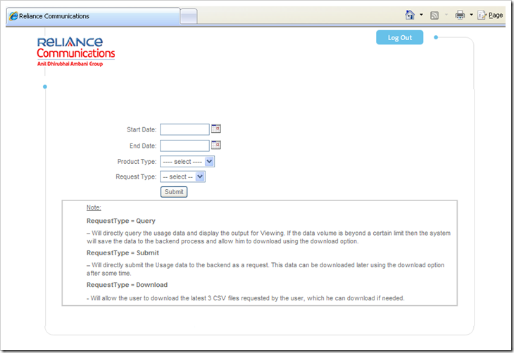
Make it Obvious – Do you have any idea what this screen is about? Even a title such as "Wireless Data Usage Query" would have been infinitely helpful!
Create visual hierarchy – Simple screen, yet there is no indication as to which fields are mandatory.
Follow conventions – The big logo on the top left looks like the home page link, but you cannot click on it.
Avoid needless text – The help text given below is worse than any text as it further confuses the user. Even a technical guy like me had hard time understanding it.
Provide proper navigation – The only navigation option after you reach this screen is to logout from the application!
Provide all the information you can – Instead of all this complexity, the better implementation would have been to display the wireless data usage for the current billing period following by an option to view the data usage for a date range.
Web accessibility – You cannot type in the date fields. There is no alt text for any of the images (Logout, Logo).
Be consistent – The date format we usually use in India is dd-MM-yyyy. Here the date fields display it as yyyy-MM-dd.
Usability checklist for Web applications
Typically usability checklists in Web application projects run into multiple pages covering all usability aspects. The problem with such checklists is that they are rarely adhered to in practice precisely due to its large size. I normally try to put together a checklist as small as possible, focusing on the 20% of the 80-20 rule (Pareto principle). This means that you can focus on the core 20% of usability issues to improve usability by 80%. Here is a concise usability checklist for Web applications,
1. Is the application screen consistent in content hierarchy & headings?2. Are all the links/buttons/labels/text/data fields uniform, relevant, correct and readable?3. Is the application screen behavior consistent & as per standard Web conventions?4. Are all the mandatory fields identifiable as mandatory fields?5. Are all the images provided with an "alt" attribute value?6. Is the tab order of fields in the application screen correct?7. Is the first entry field/action field focused when a screen is displayed?8. Is there a busy indicator for all long running or Ajax requests?9. Are all the major screen actions accessible using keyboard?10. Are all the buttons/links grouped and displayed as per application convention?
Some of the above checklist items requires the reviewer to put his thinking hat on. For example, to verify the consistency of screen behavior, reviewer must be aware of standard UI designs. Assume that a screen contains a functionality to add a list of items from a master list. Standard user interface in this case would be provide the master list on the left side with the selected items on the right side. The lists can be selected by buttons with labels "add" and "remove". It would be non standard if the master list to be below the selected list.
Many of the issues regarding consistency and convention can be mitigated by putting standard CSS files across the Web application. The Web usability checklist can be complimented by a code review checklist which mandates the use of standard CSS.